Journal
SaaS · Apr 21, 2026 · 5 min
Why most dashboards get worse over time
Every new stakeholder adds a widget, and nobody removes one. Here's how we keep dashboards usable as they grow.
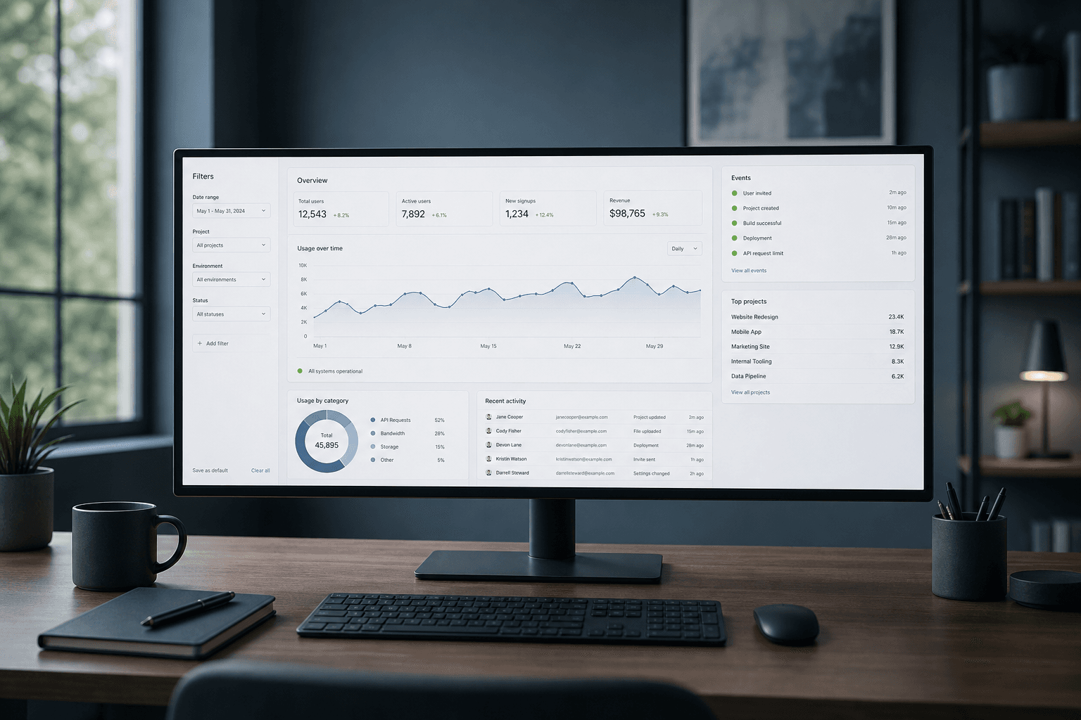
Dashboards get cluttered for a simple reason: it's easy to add a widget and hard to justify removing one. Clarity disappears one small addition at a time.
Before adding anything, we ask what decision this screen needs to support today. If a metric doesn't change what someone does next, it doesn't belong on the main screen.
Dense doesn't have to mean cluttered. A dashboard can show a lot of data if the hierarchy is clear — one primary number, supporting detail below it, color used only for status.
Empty states and error states are part of the build, not an afterthought. If the happy path looks finished and every other state looks broken, the dashboard isn't done.
We design for the person who opens this tool every day, not the person who saw it once in a demo.